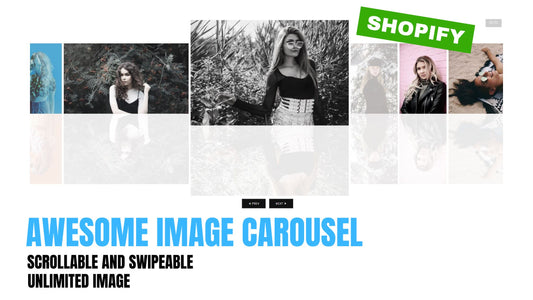
I was able to write an autoplay slider / carousel using scroll. This works with most of Shopify themes (work best in Dawn and Debut theme).
In this tutorial, we are creating a slider or carousel for a card or product card. I did provide an option to choose between the two. I also included an autoplay option, of course. You can choose from 3 to 7 products per slide, or 3 - 5 cards per slide.
I also added an options for dots and number counter. Yes, the counters work.
Check DEMO store here💻. Password: made4uo
To start:
1. Go to Admin Shopify store > Themes > Actions > Edit Code
2. In Section folder, create a new section, and name it "universal-carousel", then paste the code below.
{%- liquid assign products_to_display = section.settings.collection.all_products_count if section.settings.collection.all_products_count > section.settings.products_count assign products_to_display = section.settings.products_count endif -%} {% assign slideNum = section.settings.slide_number %} <div class="carouselContainer" id="section--{{section.id}}"> <div class="topWrapper"> {% if section.settings.title != blank %} <h2>{{section.settings.title}}</h2>{% endif %} {% if section.settings.view_all == true and section.settings.type == 'product'%} <a href="{{ section.settings.collection.url }}" id="viewAllBtn"> <span>View All</span> </a> {% endif %} </div> <carousel-component data-type="{{section.settings.type}}" data-autoplay="{{section.settings.autoplay}}" data-interval="{{section.settings.interval | times: 1000 }}" data-infinite-scroll="{{section.settings.infinite}}" data-counter-type="{{section.settings.counter_type}}"> <div class="carouselWrapper"> <ul class="carouselBox"> {% case section.settings.type %} {% when "product" %} {%- for product in section.settings.collection.products limit: section.settings.products_count-%} <li class="carouselSlider" id="slide-{% increment %}"> {% assign product_image = product.selected_or_first_available_variant %} <a class="productBox" href="{{ product.url | within: collection }}" style="text-decoration: none;"> <div class="carouselImage"> <img src="{{ product.featured_image | img_url: 'master'}}" alt="{{ product.images.alt | escape }}"/> </div> <div class="detailsText"> <span class = "productTitle"> {{ product.title }}</span> <span class = "productPrice"> {{ product.price | money }}</span> </div> </a> </li> {% endfor %} {% when "card" %} {% if section.settings.slide_number > 5 %} {% assign section.settings.slide_number = 4 %} {% else %} {% assign slide_number = section.settings.slide_number %} {% endif %} {% for block in section.blocks %} <li class="carouselSlider" id="slide-{% increment %}"> <a class="cardWrapper" {% if block.settings.card_link != blank %}href="{{block.settings.card_link}}"{% endif %}> {% assign img_url = block.settings.card_image %} {% if img_url != blank %} <div class="cardImageWrapper"> <div class="cardImage"> <img src="{{img_url | img_url: master}}" srcset="{% case img_url.width %} {% when >= 375 %}{{ img_url | img_url: '375x' }}375w, {% when >= 750 %}{{ img_url | img_url: '750x' }}750w, {% when >= 1100 %}{{ img_url | img_url: '1100x' }}1100w, {% when >= 1500 %}{{ img_url | img_url: '1500x' }}1500w, {% when >= 1780 %}{{ img_url | img_url: '1780x' }}1780w, {% when >= 2000 %}{{ img_url | img_url: '2000x' }}2000w, {% when >= 3000 %}{{ img_url | img_url: '3000x' }} 3000w, {% when >= 3840 %}{{ img_url | img_url: '3840x' }}3840w, {% else %} {{ img_url | img_url: 'master' }}w, {% endcase %}" loading="lazy" alt="{{ img_url.alt | escape }}"> </div> </div> {% endif %} {% if block.settings.card_description != blank or block.settings.title != blank %} <div class="cardDescription"> {% if block.settings.title != blank %}<h2 class="cardTitle">{{block.settings.title}}</h2>{% endif %} {{block.settings.card_description}} </div> {% endif %} </a> </li> {% endfor %} {% endcase %} </ul> </div> <div class="controlContainer"> <div class="btnContainer"> <button type="button" class="controlWrapper" id="prevSlide"> <span class="controlBtn prevBtn" ></span> </button> <ul class="slideDotContainer {% if section.settings.counter_type == 'dots' %}numberDot{% endif %}"> {% case section.settings.counter_type %} {% when 'dots' %} {% if section.settings.type == 'card' %} {% for block in section.blocks %} <li class="slideDots {% if forloop.first %}activeDot{% endif %}" data-dot-id="{{forloop.index0}}"></li> {% endfor %} <span class="activeNumber">1</span><span> / </span> <span>{% if section.settings.type == 'product' %} {{products_to_display}}{% endif %} {% if section.settings.type == 'card' %}{{section.blocks.size}}{% endif %}</span> {% endif %} {% if section.settings.type == 'product' %} {% for product in section.settings.collection.products limit: section.settings.products_count %} <li class="slideDots {% if forloop.first %}activeDot{% endif %}" data-dot-id="{{forloop.index0}}"></li> {% endfor %} <span class="activeNumber">1</span> <span>/</span> <span>{% if section.settings.type == 'product' %} {{products_to_display}}{% endif %} {% if section.settings.type == 'card' %}{{section.blocks.size}}{% endif %}</span> {% endif %} {% when 'number' %} <span class="activeNumber">1</span> / <span>{% if section.settings.type == 'product' %} {{products_to_display}}{% endif %} {% if section.settings.type == 'card' %}{{section.blocks.size}}{% endif %}</span> {% endcase %} </ul> <button type="button" class="controlWrapper" id="nextSlide" > <span class="controlBtn nextBtn"></span> </button> </div> {% if section.settings.autoplay == true %} <button type="button" class="pauseContainer" id="autoplaySlide"> <span class="pauseBtn"></span> <span class="playBtn"> </span> </button> {% endif %} </div> </carousel-component> </div> <style> #section--{{section.id}} { --text-color: {{section.settings.text_color}}; --card-bg-color: {{section.settings.card_bg_color}}; --button-color:{{section.settings.button_color}} ; --button-bg-color: {{section.settings.button_bg_color}}; --box-size: calc(100% / {{slideNum}}); } carousel-component { width: 100%; } .carouselContainer { position: relative; display: flex; flex-direction: column; justify-items: center; align-items: center; margin: 50px; } .topWrapper { display: flex; justify-content: space-between; width: 100%; align-items: center; margin-bottom: 1rem; } .topWrapper h2 { margin: auto; } .carouselWrapper { width: 100%; height: 100%; position: relative; display: flex; flex-direction: column; justify-content: space-between; align-items: stretch; } .carouselBox{ width: 100%; padding: 3.5% 0; display: flex; align-items: flex-start; margin: 0; flex-wrap: inherit; overflow-x: auto; scroll-snap-type: x mandatory; scroll-behavior: smooth; -webkit-overflow-scrolling: touch; -ms-overflow-style: none; scrollbar-width: none; } .carouselBox::-webkit-scrollbar { display: none; } .carouselSlider { min-width: var(--box-size); width: 100%; display: flex; flex-direction: column; justify-content: center; padding-right: 2%; transition: all ease .5s; } /*===== PRODUCT ==== */ .productBox { background: var(--bg-color); display: flex; text-decoration: none; height: 100%; flex-direction: column; justify-content: space-between; } .productBox:hover { background: var(--box-bg-color); transform: scale(1.05); } .carouselImage { width: 100%; height: 100%; object-fit: cover; object-position: center center; } .carouselImage > img { width: 100%; } .detailsText { display: flex; flex-direction: column; align-items: flex-start; line-height: 1.2; font-size: clamp(10px, 1.5vw ,18px); color: var(--text-color); height: 100%; width: 100%; white-space: normal; overflow: hidden; padding: 5%; } .productPrice { padding-top: 1%; font-size: clamp(10px, 2vw ,18px); font-weight: 600; margin-top: 10px; } .numberDot > span { display: none; } /* === NUMBER OF SLIDES === */ @media screen and (max-width: 750px) { .carouselSlider { height: 100%; min-width: 33.5% !important; } .slideDots { display: none !important; } .numberDot > span { display: block !important; } } @media screen and (max-width: 481px) { .carouselContainer { margin: 4%; } .carouselBox { padding: 1.5% 0; } .carouselSlider { padding-left: 4%; min-width: 50% !important; } .detailsText { font-size: 2.5vw; } .controlContainer:hover { transform: scale(1.05); } #viewAllBtn { line-height: 1.2; } } /*===== CARD ==== */ .cardWrapper { width: 100%; height: 100%; position: relative; padding: 5%; background-color: var(--card-bg-color); overflow: hidden; } .cardWrapper:hover .cardImage { transform: scale(1.05); } .cardWrapper:hover .cardImageWrapper { overflow: visible; transform: scale(1.05); } .cardImageWrapper { position: relative; width: 100%; overflow: hidden; grid-row: 1 / 2; transition: all ease .5s; } .cardImage { width: 100%; height: 100%; transition: all ease .5s; overflow: hidden; } .cardImage > img { width: 100%; aspect-ratio: 1; object-fit: cover; object-position: center center; vertical-align: middle; } .cardTitle { width: 100%; margin: 5% 0; text-align: center; font-weight: 600; font-size: clamp(9px, 1.5vw, 19px); line-height: 1.2; grid-row: 2 / 3; color: var(--text-color); } .cardDescription { width: 100%; line-height: 1.2; grid-row: 3 / 4; padding: 5px; } .cardDescription p { font-size: clamp(8px, 1.2vw, 18px); margin: 0; text-overflow: ellipsis; color: var(--text-color); text-align: center; } /* ====== CONTROLS ===== */ .controlContainer { display: flex; justify-content: center; transition: all ease .5s; } .controlContainer button { background-color: transparent; } .controlContainer button > span { background-color: var( --button-color); } .controlContainer:hover { transform: scale(1.05); } .btnContainer { height: 30px; display: flex; justify-content: space-between; align-items: center; color: var(--button-color); padding: .5%; } .controlWrapper { width: 50px; height: inherit; position: relative; display: flex; align-items: center; cursor: pointer; justify-content: space-evenly; border: none; transition: transform ease .5s; } .controlBtn { display: inline-block; width: 25px; height: 15px; background-color: var(--button-color); border: none; transition: transform ease .5s; } .controlWrapper:hover .controlBtn{ transform: scale(1.05); } .controlWrapper:hover { transform: scale(1.05); } #nextSlide:disabled .controlBtn { background-color: #c3c5b8; } .nextBtn { -webkit-clip-path: polygon(15% 0, 65% 50%, 15% 100%, 0 85%, 35% 50%, 0 15%); clip-path: polygon(15% 0, 65% 50%, 15% 100%, 0 85%, 35% 50%, 0 15%); margin-right: -10px; } #prevSlide:disabled .controlBtn { background-color: #c3c5b8; } .prevBtn { -webkit-clip-path: polygon(100% 15%, 65% 50%, 100% 85%, 85% 100%, 35% 50%, 85% 0); clip-path: polygon(100% 15%, 65% 50%, 100% 85%, 85% 100%, 35% 50%, 85% 0); margin-left: -10px; } .pauseContainer { position: relative; width: 30px; height: 30px; margin-left: 1rem; display: flex; justify-content: center; align-items: center; border: none; } .pauseBtn { width: 50%; height: 50%; position: absolute; background-color: var(--button-color); -webkit-clip-path: polygon(0% 0%, 0% 100%, 40% 100%, 40% 0, 60% 0, 60% 99%, 100% 100%, 100% 0%); clip-path: polygon(0% 0%, 0% 100%, 40% 100%, 40% 0, 60% 0, 60% 99%, 100% 100%, 100% 0%); } .playBtn { width: 50%; height: 60%; display: none; position: absolute; background-color: var(--button-color); -webkit-clip-path: polygon(0 0, 0 100%, 100% 49%); clip-path: polygon(0 0, 0 100%, 100% 49%); } .playBtn:hover { transform: scale(1.05); background-color: var( --button-color); } .pauseBtn:hover { transform: scale(1.05); background-color: var( --button-color); } /*=== DOT CONTROL ====*/ .slideDotContainer { position: relative; width: 100%; height: inherit; margin: 0 .5rem; display: flex; padding: 0; justify-content: space-around; align-items: center; flex-wrap: inherit; overflow-x: auto; scroll-snap-type: x mandatory; scroll-behavior: smooth; -webkit-overflow-scrolling: touch; -ms-overflow-style: none; /* IE and Edge */ scrollbar-width: none; } .slideDots:hover { transform: scale(1.05); } .slideDots { position: relative; background-color: transparent; border: 2px solid var(--button-color); width: 10px; height: 10px; border-radius: 50%; margin: 0 1px; list-style-type: none; } .activeDot { background-color: var(--button-bg-color); } /*=== VIEW ALL CONTROL ====*/ #viewAllBtn { display: inline-block; border-radius: 5px; padding: 5px 10px; color: white; font-weight: 600; box-shadow: 2px 2px 2px black; background-color: var(--button-color); text-decoration: none; text-align: center; } #viewAllBtn:hover::after { content: "Products"; } #viewAllBtn:active{ box-shadow: none; transform: translateY(-2%); } </style> {% schema %} { "name": "Universal Carousel", "settings": [ { "type": "text", "id": "title", "label": "carousel name" }, { "type": "select", "id": "type", "default": "product", "label": "type of item", "options": [ { "value": "product", "label": "product" }, { "value": "card", "label": "card" } ] }, { "type": "collection", "id": "collection", "label": "Collection" }, { "type": "checkbox", "id": "autoplay", "default": false, "label": "Autoplay" }, { "type": "checkbox", "id": "view_all", "default": false, "label": "Show view all button (only available in product type)" }, { "type": "checkbox", "id": "infinite", "default": false, "label": "Infinite Scroll" }, { "type": "range", "id": "interval", "label": "interval", "max": 15, "min": 1, "step": 1, "unit": "s", "default": 3 }, { "type": "range", "id": "slide_number", "min": 3, "max": 7, "label": "Number of slides to display (desktop only)", "default": 4 }, { "type": "range", "id": "products_count", "min": 4, "max": 100, "label": "Number of products to display", "default": 4 }, { "type": "select", "id": "counter_type", "default": "number", "label": "type of counter", "options": [ { "value": "dots", "label": "dots" }, { "value": "number", "label": "number" } ] }, { "type": "header", "content": "Section color" }, { "type": "color", "id": "text_color", "label": "Text color", "default": "#232b2b" }, { "type": "color", "id": "card_bg_color", "label": "Card background color", "default": "#232b2b" }, { "type": "color", "id": "button_color", "label": "Button color", "default": "#232b2b" }, { "type": "color", "id": "button_bg_color", "label": "Button background color", "default": "#232b2b" } ], "blocks": [ { "type": "card", "name": "card", "settings": [ { "type": "image_picker", "id": "card_image", "label": "card image" }, { "type": "text", "id": "title", "label": "title" }, { "type": "richtext", "id": "card_description", "label": "description", "default": "<p>Write your drescription here</p>" }, { "type": "url", "id": "card_link", "label": "card link" } ] } ], "presets": [ { "name": "Universal Carousel" } ] } {% endschema %} |
3. We need the file that contains the javascript. Under the asset folder, open the "theme.js" or "global.js" file and paste the code below.
class CarouselComponent extends HTMLElement { constructor() { super(); this.slideBox = this.querySelector('.carouselBox'); this.slides = this.querySelectorAll('.carouselSlider'); this.slideLot = this.querySelector('.activeNumber'); this.prevBtn = this.querySelector("#prevSlide"); this.nextBtn = this.querySelector("#nextSlide"); this.pausePlay = this.querySelector(".pauseContainer"); this.slideDots = this.querySelectorAll('.slideDots'); this.counter = this.dataset.counterType; this.interval = this.dataset.interval; this.infinite = this.dataset.infiniteScroll; this.autoplay = this.dataset.autoplay; if(!this.slideDots) return; this.slideDots.forEach( dot => dot.addEventListener('click', this.showDot.bind(this))); this.timeout; this.curSlide = 0; if(this.autoplay == 'true') { this.autoPlayFx(); this.infinite = 'true'; }else { clearInterval(this.autoplaying); this.infinite = 'false'; } this.init() const resizeObserver = new ResizeObserver(entries => this.init()); resizeObserver.observe(this.slideBox); this.prevBtn.addEventListener("click", this.prevFx.bind(this)); this.nextBtn.addEventListener("click", this.nextFx.bind(this)); if(!this.pausePlay) return; this.pausePlay.addEventListener("click", this.pauseFx.bind(this)); } init() { if (this.counter == 'number') { this.slideLot.innerHTML = 1; } this.goToSlide(0); } autoPlayFx(){ clearInterval(this.autoplaying); this.autoplaying = setInterval(this.nextFx.bind(this), this.interval); } pauseFx() { this.pauseBtn = this.pausePlay.querySelector('.pauseBtn'); this.playBtn = this.pausePlay.querySelector('.playBtn'); if (this.autoplay === 'true'){ clearInterval(this.autoplaying); this.autoplay = 'false'; this.playBtn.style.display = "block"; this.pauseBtn.style.display = "none"; }else{ if(this.curSlide == this.slides.length -1) { this.curSlide = -1; } this.autoPlayFx(); this.autoplay = 'true'; this.playBtn.style.display = "none"; this.pauseBtn.style.display = "block"; } } prevFx () { this.curSlide--; if(this.curSlide < 0){ if(this.infinite == 'true') { this.curSlide = this.slides.length - 1; } else { this.curSlide = 0; } } this.goToSlide(this.curSlide ); this.activeSlide(this.curSlide ); } nextFx () { this.curSlide ++ if(this.curSlide == this.slides.length) { if(this.infinite == 'true') { this.curSlide = 0; } if(this.autoplay == 'true') { this.curSlide = 0; } } this.goToSlide(this.curSlide ); this.activeSlide(this.curSlide ); } showDot(e) { if(!e.currentTarget) return; const currentDot = e.currentTarget.dataset.dotId; this.activeSlide(currentDot); } goToSlide (slide) { let leftScroll = slide * this.slides[0].clientWidth; this.slideBox.scrollTo({left: leftScroll}); } activeSlide(currentDot) { this.slideDots.forEach(dot => dot.classList.remove('activeDot')); if(this.infinite == 'false') { if(currentDot == this.slides.length - 1) { this.nextBtn.setAttribute('disabled', true); } else { this.nextBtn.removeAttribute('disabled'); } if(currentDot == 0) { this.prevBtn.setAttribute('disabled', true); } else { this.prevBtn.removeAttribute('disabled'); } } this.slideLot.innerHTML = currentDot + 1; if(! this.slideDots[currentDot]) return; this.slideDots[currentDot].classList.add('activeDot'); this.showDot(currentDot); this.curSlide = currentDot; this.goToSlide(currentDot ); } } customElements.define('carousel-component', CarouselComponent); |
That is it. Let me know if you have questions (",)
Updated 3/18/22: You can add multiple of this section in one page.
1 comentário
Thanks for great video. How can I set minimum card number to 1 ?