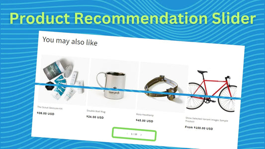
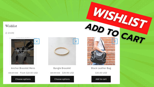
Compatibility: All Shopify 2.0 FREE themes ONLY. Works from lower version to version 11
Product recommendations or related products are essential to any e-commerce site. They provide customers with additional options and increase the chances of making a sale. However, displaying these products can sometimes take up too much space on your product page, leading to a cluttered and overwhelming shopping experience.
One solution to this problem is to convert product recommendations or related products into a slider. By using a slider, you can showcase a variety of products in a visually appealing and organized way. This allows customers to easily browse through the recommendations without having to navigate through a long list of products.
Moreover, a slider provides a more interactive and engaging shopping experience for customers. By allowing them to swipe through a range of products, they can quickly find the ones that catch their eye. This also encourages them to spend more time on your site, increasing the chances of making a purchase.
Implementing a slider for product recommendations or related products is also relatively simple. Many e-commerce platforms offer built-in slider options, or you can use a third-party plugin to create one. With a few clicks, you can transform your product page into a sleek and modern shopping experience.
Explore our DEMO store and see this product in action! Use the password "made4uo" to enter. Please note that quickview functionality is not included.
What are Product Recommendation to Slider?
In the context of Shopify stores, a product recommendation to slider refers to the process of transforming a static list of recommended products into a dynamic slider format.
Here's a breakdown of the terms:
- Product Recommendation: On an e-commerce website like Shopify, product recommendations are a list of products suggested to a customer based on their browsing history, previously viewed items, or similar factors. These recommendations are typically displayed on product pages or category pages to encourage further exploration and potentially lead to additional purchases.
- Slider: A slider is an interactive element on a website that displays a carousel of images, content, or products. Users can navigate through the slider by clicking arrows, dots, or swiping (on mobile devices) to see additional items within the carousel.
So, converting a product recommendation to a slider essentially means changing the format of how recommended products are displayed on your Shopify store. Instead of a static list, they become part of a dynamic carousel that users can interact with to browse through the recommendations.
Why Use Product Recommendation to Slider?
There are several advantages to converting product recommendations from a static list to a slider format on your Shopify store:
- Increased Visibility: A slider format allows you to showcase multiple product recommendations on a single page. This potentially increases the overall visibility of these recommendations compared to a static list, which might get overlooked by some users.
- Enhanced Engagement: The interactive nature of a slider encourages users to browse through the recommendations. Users can easily navigate through the carousel to see additional items, potentially leading to increased product discovery and exploration beyond the initial few recommendations displayed in a static list.
- Improved Design Appeal: A well-designed slider can add a dynamic and visually appealing element to your store. This can enhance the overall user experience and potentially make the product recommendations more attention-grabbing compared to a plain static list.
- Focus on Specific Recommendations: Sliders allow you to control the order and potentially highlight certain product recommendations within the carousel. This can be useful for promoting specific products or strategically placing high-converting items within the user's view.
Additional Considerations:
While product recommendation sliders offer a dynamic and engaging way to showcase suggested items on your Shopify store, here are some additional factors to consider for a successful implementation:
-
Content Curation and Design:
- Quality Over Quantity: Focus on displaying a curated selection of relevant product recommendations within the slider. Don't overload it with too many items, as this can overwhelm users and reduce the effectiveness of the recommendations.
- Compelling Visuals: Use high-quality product images and potentially consider including clear and concise product titles or descriptions within the slider. This provides users with a quick snapshot of each product and incentivizes them to click for more details.
- Branding Consistency: Maintain a design aesthetic for the slider that aligns with your overall brand identity. This includes using colors, fonts, and visual elements consistent with your store's theme to create a cohesive user experience.
-
Slider Functionality and Optimization:
- Mobile-Friendly Design: Ensure the slider functions flawlessly on mobile devices, considering the smaller screen size and potential touch interactions. Users should be able to navigate the slider easily and view product details without encountering any difficulties.
- Navigation Clarity: Provide clear and intuitive navigation controls (arrows, dots) for users to browse through the slider. Avoid complex or confusing navigation elements that might frustrate users.
- Loading Speed: Optimize the slider's design and code (if applicable) to ensure it loads quickly and doesn't slow down your page loading speed. A sluggish slider can negatively impact the user experience.
What you are buying:
- A product recommendation or a related products section in a slider
- No external library being use
What makes our code better:
- We do not use external libraries, with that being said, our code will have no to minimal effect to your website's speed performance
- We do not leave or add codes use to advertise for our website
- Our code is mobile friendly
Any issues related to the code will be fix with no additional cost, excluding code customization requests. Simply contact us with "Chat with us." We are just a button away.
Steps on how to add product recommendation to slider
Step #1. Open your code editor
From you Admin page, go to Online store, then Themes. Choose the theme you want to edit, then click the three dots, then Edit code.
Step #2. Create a new section file
In Section folder, find the product-recommendations.liquid or related-products.liquid for newer versions of Shopify 2.0 themes, then replace the default code with the code below.
Step #3. Save the changes
Once you've added the code, save your changes to the theme code by clicking the SAVE button on the right hand upper corner.
Step #4. Customize theme
Go to the theme editor by clicking three dots on your left hand upper corner, then Customize theme. Make sure to SAVE once you are done customizing.
Conclusion
Transforming product recommendations from static lists into dynamic sliders offers a winning strategy for your Shopify store (Dawn theme and similar). Product recommendation sliders can become powerful tools for driving product discovery, boosting user engagement, and ultimately increasing sales on your Shopify store. Slide your way to success by implementing product recommendation sliders thoughtfully and witness the positive impact they can have on your business!
Copied!


