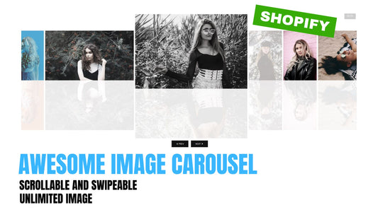
Compatibility: Shopify 2.0 FREE themes only
Looking for a way to showcase your featured products on your website's homepage? A product collection slider can be a great solution! With this simple and customizable code, you can easily create a stylish and responsive slider that highlights your top products in an eye-catching way.
Whether you're looking to promote specific products, sales, or just want to showcase your best-sellers, a product collection slider can help draw attention to your key offerings. Check out our step-by-step guide and start customizing your product collection slider today!
However, it's important to note that this code may not work with the updated Dawn theme on Shopify. In that case, we recommend checking out our updated product collection slider instead.
To start:
1. Go to your Online store > Themes > Actions > Edit code
2. Go to Section folder and create a section, we will name it "collection-slider"
3. In the new section, paste the code below, then click SAVE
{{ 'component-card.css' | asset_url | stylesheet_tag }} {{ 'component-price.css' | asset_url | stylesheet_tag }} {{ 'component-product-grid.css' | asset_url | stylesheet_tag }} {{ 'collection-slider.css' | asset_url | stylesheet_tag }} <link rel="stylesheet" href="{{ 'template-collection.css' | asset_url }}" media="print" onload="this.media='all'"> <noscript>{{ 'template-collection.css' | asset_url | stylesheet_tag }}</noscript> {%- liquid assign products_to_display = section.settings.collection.all_products_count assign total_products = section.settings.collection.products.size if section.settings.collection.all_products_count > section.settings.products_to_show assign products_to_display = section.settings.products_to_show endif -%} <div class="slider-container collection page-width page-width-desktop"> <div class="title-wrapper-with-link{% if section.settings.title == blank %} title-wrapper-with-link--no-heading{% endif %}{% if section.settings.collection.all_products_count > 2 and section.settings.swipe_on_mobile and section.settings.products_to_show > 2 %} title-wrapper--self-padded-tablet-down{% endif %}" style="width: 100%" > <h2 class="title{% if section.settings.title == blank %} title--no-heading{% endif %}"> {{ section.settings.title | escape }} </h2> {% if section.settings.view_all == true %} <a href="{{ section.settings.collection.url }}"> <button class="button button--primary">View All</button> </a> {% endif %} </div> <slider-component style="display: block;"> <ul class=" product-slider-box grid grid--2-col product- {% if total_products == 4 or section.settings.collection == blank %} grid--2-col-tablet grid--4-col-desktop {% else %} grid--3-col-tablet{% endif %}{% if total_products > 4 %} grid--one-third-max grid--4-col-desktop grid--quarter-max{% endif %} {% if total_products > 2 %} slider slider--tablet grid--peek{% endif %} negative-margin--small " role="list" id="product-slider-box" > {%- for product in section.settings.collection.products limit: section.settings.product_to_show -%} <li class="product-slider grid__item slider__slide" id="product-slider" data-slide-index="{{forloop.index}}" > {% if section.settings.updated_theme %} {% render 'card-product', product_card_product: product, media_size: section.settings.image_ratio, show_secondary_image: section.settings.show_secondary_image, add_image_padding: section.settings.add_image_padding, show_vendor: section.settings.show_vendor, show_image_outline: section.settings.show_image_outline, show_rating: section.settings.show_rating %} {% else %} {% render 'product-card', product_card_product: product, media_size: section.settings.image_ratio, show_secondary_image: section.settings.show_secondary_image, add_image_padding: section.settings.add_image_padding, show_vendor: section.settings.show_vendor, show_image_outline: section.settings.show_image_outline, show_rating: section.settings.show_rating %} {% endif %} </li> {%- else -%} {%- for i in (1..4) -%} <li class="grid__item"> {% if section.settings.updated_theme %} {% render 'card-product', show_vendor: section.settings.show_vendor %} {% else %} {% render 'product-card-placeholder' %} {% endif %} </li> {%- endfor -%} {%- endfor -%} </ul> {%- if section.settings.collection.all_products_count > 4 -%} <div class="slider-buttons no-js-hidden {% if total_products < 4 %} small-hide{% endif %}" style="display: flex;"> <button type="button" class="slider-button slider-button--prev" name="previous" aria-label="Slide left" > {% render 'icon-caret' %} </button> <div class="slider-counter caption"> <span class="slider-counter--current">1</span> <span aria-hidden="true"> / </span> <span class="visually-hidden">of</span> <span class="slider-counter--total" data-total-products="{{total_products}}" > {{- total_products -}} </span> </div> <button type="button" class="slider-button slider-button--next" name="next" aria-label="Slide right" > {% render 'icon-caret' %} </button> </div> {%- endif -%} </slider-component> </div> {% schema %} { "name": "Collection Slider", "tag": "section", "class": "spaced-section", "settings": [ { "type": "text", "id": "title", "default": "Featured Collection", "label": "Heading" }, { "type": "collection", "id": "collection", "label": "Collection" }, { "type": "checkbox", "id": "updated_theme", "default": true, "label": "Updated Shopify theme, version 8 and higher" }, { "type": "range", "id": "product_to_show", "default": 10, "min": 1, "max": 100, "label": "number of products to show" }, { "type": "checkbox", "id": "swipe_on_mobile", "default": false, "label": "Enable swipe on mobile" }, { "type": "header", "content": "Product card" }, { "type": "checkbox", "id": "view_all", "default": false, "label": "Show View All button" }, { "type": "select", "id": "image_ratio", "options": [ { "value": "adapt", "label": "Adapt" }, { "value": "portrait", "label": "Portrait" }, { "value": "square", "label": "Square" } ], "default": "adapt", "label": "Image ratio" }, { "type": "checkbox", "id": "show_secondary_image", "default": false, "label": "Show secondary image" }, { "type": "checkbox", "id": "add_image_padding", "default": false, "label": "Add image padding" }, { "type": "checkbox", "id": "show_image_outline", "default": true, "label": "Show image outline" }, { "type": "checkbox", "id": "show_vendor", "default": false, "label": "Show vendor" }, { "type": "checkbox", "id": "show_rating", "default": false, "label": "Show product rating", "info": "To display a rating, add a product rating app. [Learn more](https://help.shopify.com/manual/online-store/themes/theme-structure/theme-features#featured-collection-show-product-rating)" } ], "presets": [ { "name": "Collection Slider" } ] } {% endschema %} |
4. Go to Asset folder, create a new file, name it "collection-slider"
5. Open the newly created CSS folder and paste the code below, then click SAVE
.slider-container { padding: 0 3rem; width: 100%; overflow: auto; display: flex; flex-flow: column wrap; align-items: center; position: relative; } .slider-container.collection ul { padding-inline-start: 0px !important; } .slider-container.collection slider-component { position: relative; display: block; width: 100%; } .slider-container.collection .slider__slide { scroll-snap-align: start; flex-shrink: 0; } .product-slider-box { flex-wrap: inherit; overflow-x: auto; scroll-snap-type: x mandatory; scroll-behavior: smooth; -webkit-overflow-scrolling: touch; margin-bottom: 1rem; width: 100%; height: 100%; display: flex; } .product-slider { height: 100%; width: calc(50% - 0.5rem / 2) !important; display: inline-block; } .slide-image { width: 100%; height: 100%; object-fit: cover; } @media screen and (max-width: 989px) { .grid__item { padding-left: 1rem; } } /* navigation slider */ .slider-buttons { display: flex !important; } .slider { scrollbar-color: rgb(var(--color-foreground)) rgba(var(--color-foreground), 0.04); -ms-overflow-style: none; scrollbar-width: none; } .slider::-webkit-scrollbar { height: 0.4rem; width: 0.4rem; display: none; } .no-js .slider { -ms-overflow-style: auto; scrollbar-width: auto; } .no-js .slider::-webkit-scrollbar { display: initial; } .slider::-webkit-scrollbar-thumb { background-color: rgb(var(--color-foreground)); border-radius: 0.4rem; border: 0; } .slider::-webkit-scrollbar-track { background: rgba(var(--color-foreground), 0.04); border-radius: 0.4rem; } .slider-counter { margin: 0 1.2rem; } .slider-buttons { display: flex; align-items: center; justify-content: center; } .slider-button { color: rgba(var(--color-foreground), 0.75); background: transparent; border: none; cursor: pointer; width: 44px; height: 44px; } .slider-button:not([disabled]):hover { color: rgb(var(--color-foreground)); } .slider-button .icon { height: 0.6rem; } .slider-button[disabled] .icon { color: rgba(var(--color-foreground), 0.3); } .slider-button--next .icon { margin-right: -0.2rem; transform: rotate(-90deg) translateX(0.15rem); } .slider-button--prev .icon { margin-left: -0.2rem; transform: rotate(90deg) translateX(-0.15rem); } .slider-button--next:not([disabled]):hover .icon { transform: rotate(-90deg) translateX(0.15rem) scale(1.07); } .slider-button--prev:not([disabled]):hover .icon { transform: rotate(90deg) translateX(-0.15rem) scale(1.07); } |
6. We need to go to the Asset folder again. Open the global.js file and find the slider-component. At the connstructor, lets add this code below
this.productSlider = this.querySelector('.product-slider-box'); |
7. At the initPages section, replace the this.totalPages with the code below
if (this.productSlider) { this.totalPages = sliderItemsToShow.length - this.slidesPerPage + 4} else { this.totalPages = sliderItemsToShow.length - this.slidesPerPage + 1; } |
8. At the update() section, replace the this.currentPage with the code below
if (this.productSlider) {this.currentPage = Math.round(this.slider.scrollLeft / this.sliderLastItem.clientWidth) + 4} else { this.currentPage = Math.round(this.slider.scrollLeft / this.sliderLastItem.clientWidth) + 1; } |
Your code at global.js should look like below

Updated 10/19/21: For issues with the image has a different height with the ones.
Updated 11/12/21: Added a product-limit range.
Updated 11/24/21: Added a show all button. See the section settings to click the show all button.
Updated 05/22/23: Works with all version of Shopify FREE themes
That's it (",). Let me know if you have questions
10 comments
The Counter below the slider starting from 4 can you do No. of slides starting from 1 instead of no. of products starting from 4.
Can you please change the count number? It starts from 4, but it should be 1, and it should count pages, not products. I mean I prefer that way. Can you make the change please ?
Here I found bug please solve the number next and prev not proper
Hi @Arslan Ali
I did update the code for that. See above
First slider’s image has more height than other sliders. Please help